case study — cinched
Making fashion more personal, social, and effortless.
- team
- 1 Product Designer
- 2 Software Engineers
- role
- Product Designer
- timeline
- Apr. 2025 - Sept. 2025
- skills
- Wireframing
- Mobile Design
- Prototyping
- tools
- Figma

01 / overview

A closet that feels like yours
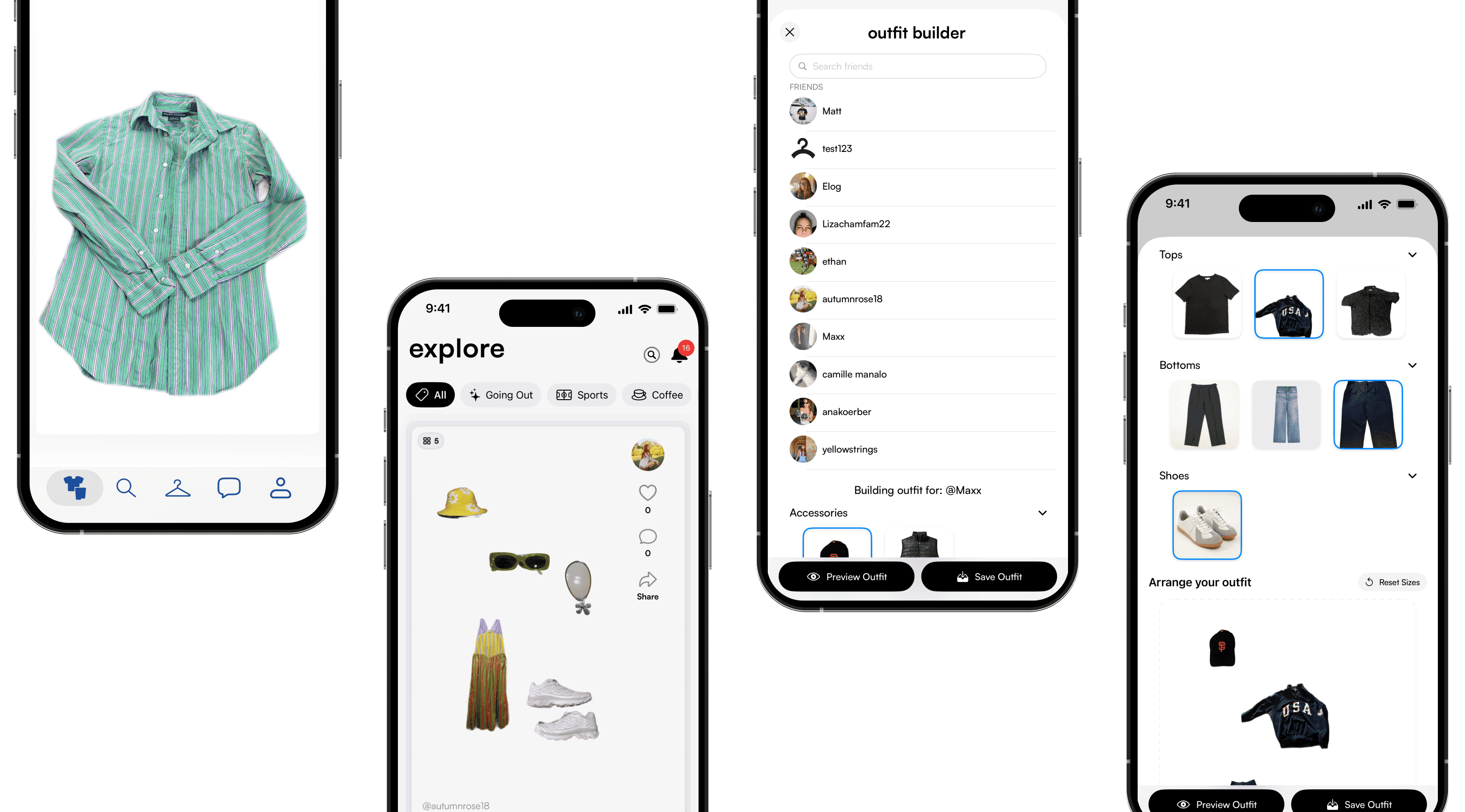
Cinched is a vintage resale and style platform that rejects the “trend cycle.” Build digital closets, create outfits, and share your aesthetic.
As the sole product designer, I led Cinched from ambiguous concept to a functional MVP: UX strategy, information architecture, visual identity, and a scalable design system for web and mobile.
02 / the insight
Why we built this
People didn’t need a store. They needed a tool.
Outfit fatigue
87%
No tool to style
Business goal: retention
03 / assumptions and hypothesis
Where the hypothesis came from
We started with a founder’s belief: people don’t just buy and sell clothes, they express identity through style.
Fifteen interviews and a direct Depop and Poshmark audit tested that belief before we committed to build. The 87% stat and the closet quote turned intuition into direction.
04 / research
How Depop and Poshmark compare
15 interviews with vintage enthusiasts, plus a direct audit of Depop and Poshmark.
Both have strong discovery and social features, but both are built around transactions. Depop’s new Outfits tool styles shoppable collages; Poshmark’s “closet” is a seller’s inventory.
Neither gives people a private space to catalog and combine what they already own. Cinched’s digital closet has the opposite goal: buying less by making your wardrobe usable again.
“I spend hours scrolling Depop, but I still have nothing to wear. I forget what’s even in my own closet.”
Where They Fall Short
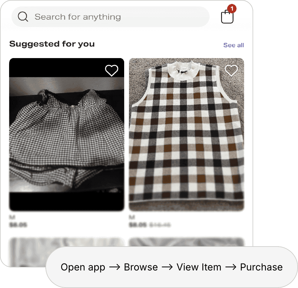
Commerce-first mindset limits creative expression
 Can’t combine multiple items digitally
Item overload
05 / design and iteration
Wireframing, prototyping, usability testing
I tested drag-and-drop, swipe-to-add, and template-based builders. Drag-and-drop won on playfulness and flexibility.
The call came from early build reviews, not an A/B test. With two engineers and no live users, waiting for statistical proof meant not shipping, so I chose to validate after launch.
What we tried and left behind
Swipe-to-add
Template-based
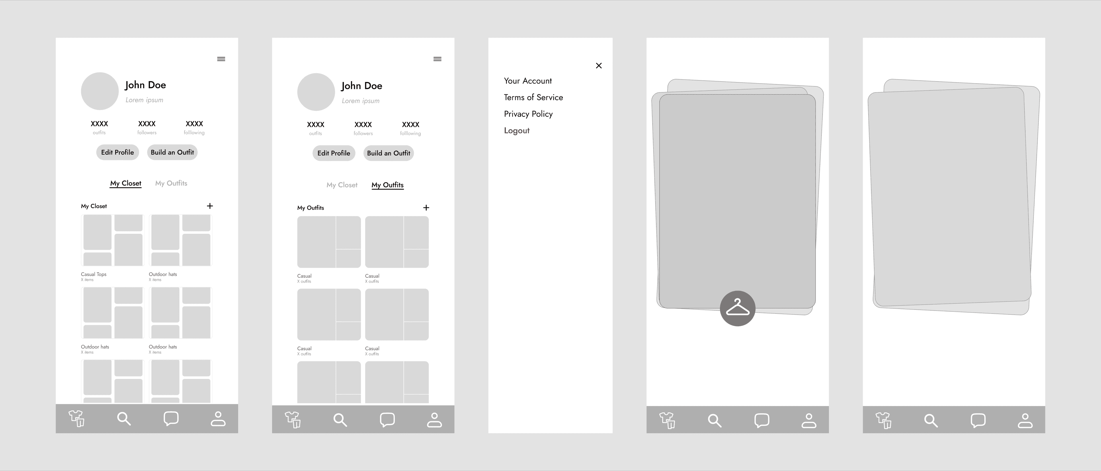
I also tested stacked cards for closet item selection, to see how tactile the experience could feel.
06 / the solution
Five core features that celebrate personal style
I designed Cinched around the idea that your closet should feel like a playground—a space to experiment, create, and share without pressure or judgment.
01
Style Onboarding
02
Outfit Builder
03
Digital Closet
04
Outfit Playground
05
Wishlist
07 / final results + reflections
In-person Pop-up Metrics
Cinched shipped as an MVP with the outfit builder, digital closet, and wishlist. Our first in-person pop-up in Austin, TX was the real-money test: $127.65 across 9 sales in 3.5 hours, 80% through Apple Pay, and zero sales lost to friction, including one buyer who waited out a checkout hiccup.
Card buyers spent roughly 2x more per order than cash buyers ($17.11 vs. $8.33). That demand moved seller storefronts to our next build priority.
The pop-up proves the transactional side. Closet engagement is still unmeasured, since we hadn’t instrumented usage tracking. Analytics for return visits and outfits created is the next infrastructure priority.
$127.65
TOTAL REVENUE
80%
VIA APPLE PAY
2x
CASH V CARD SPEND
9
TOTAL SALES
08 / the setback
Shipping without a way to prove the core bet
The biggest failure was sequencing, not design. With two engineers and a hard MVP deadline, analytics kept losing to core flows.
Cinched launched with proof that the transactional side works, but no way to know if the digital closet changes behavior: no return-visit rate, no outfit counts. I treated instrumentation as an add-on instead of scoping it into the MVP for the feature we were betting on.
09 / looking back
What I’d do differently
01
Ship instrumentation with the bet
02
Get a direct line to users
03
Validate the outfit builder first
04
Pull seller storefronts earlier
10 / reflection
Reflection & Lessons Learned
I prioritized the styling side, treating buying and selling as infrastructure. The Austin pop-up changed my mind: watching $127.65 change hands made it clear real commerce was happening whether or not I’d designed for it.
User research tells you what people want to do. Watching real money move tells you what they’re already doing, and the second can override the first.