case study — la jolla florist
Bridget’s Blooms website redesign
- team
- 2 Product Designers
- 2 UX Researchers
- role
- Product Designer
- timeline
- Jan. 2025 - Mar. 2025
- skills
- UX Design
- Visual Design
- Prototyping
- tools
- Figma
- Wix Studio
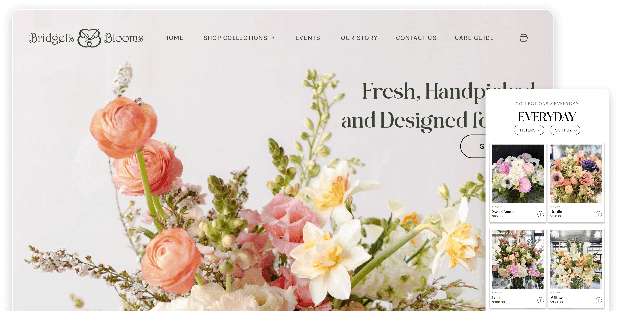
01 / tl;dr
A La Jolla florist had loyal customers and a broken website
Bridget’s Blooms grew from a tiny flower stand into a La Jolla institution over 40 years. When COVID hit, she quickly built an online shop. It worked, but it never felt like her.
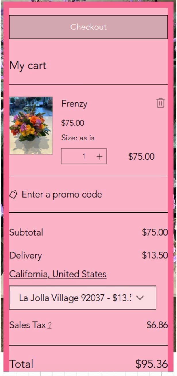
Customers couldn’t enter delivery dates. Prices were buried. The homepage looked nothing like the warm, open, fragrant shop they loved.
I led visual design and the checkout flow on a four-person team. The mobile and desktop prototypes shipped, unfamiliar users navigated them unassisted, and the client said it felt “more lively” and truer to her brand.
02 / the challenge
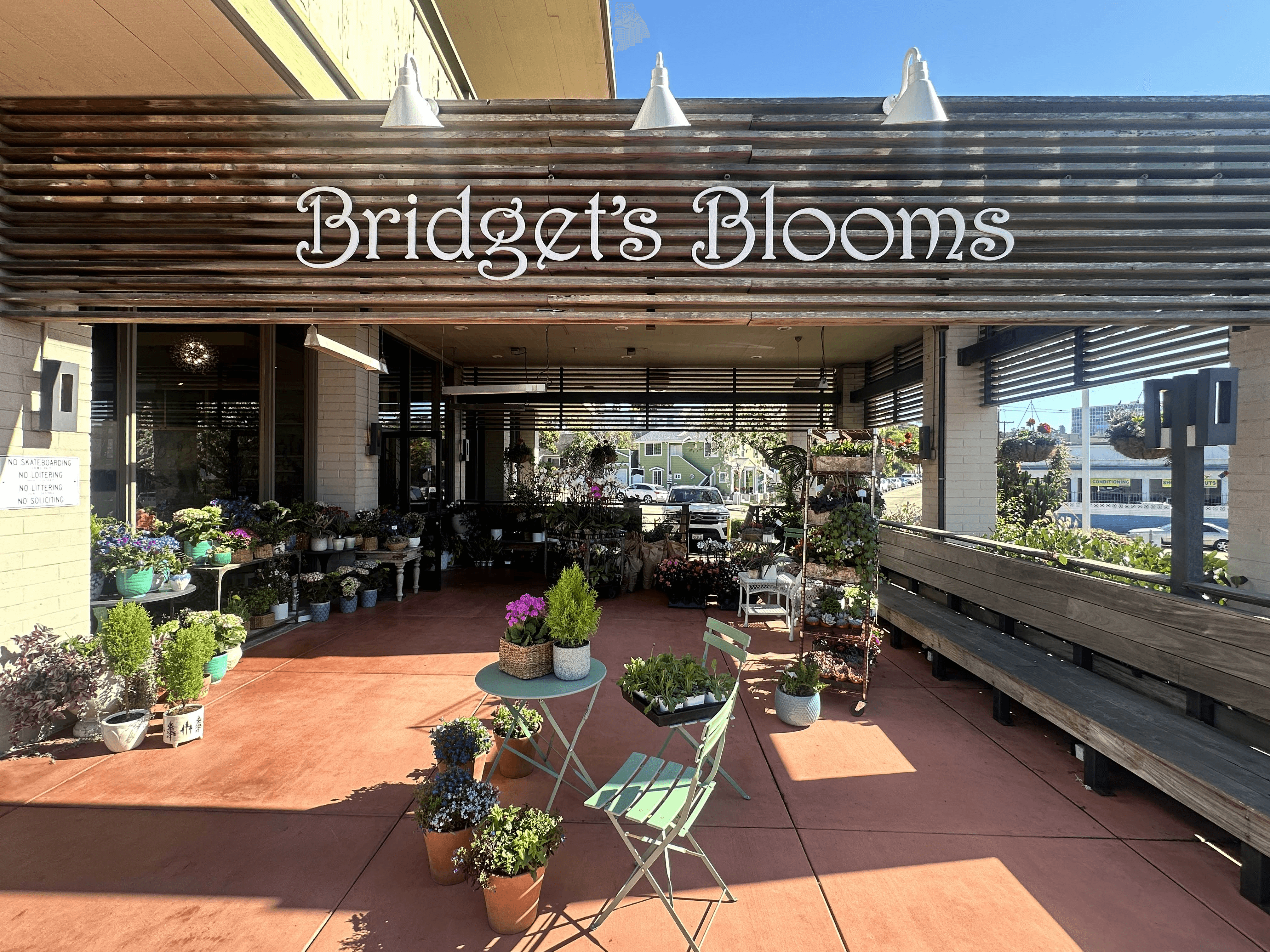
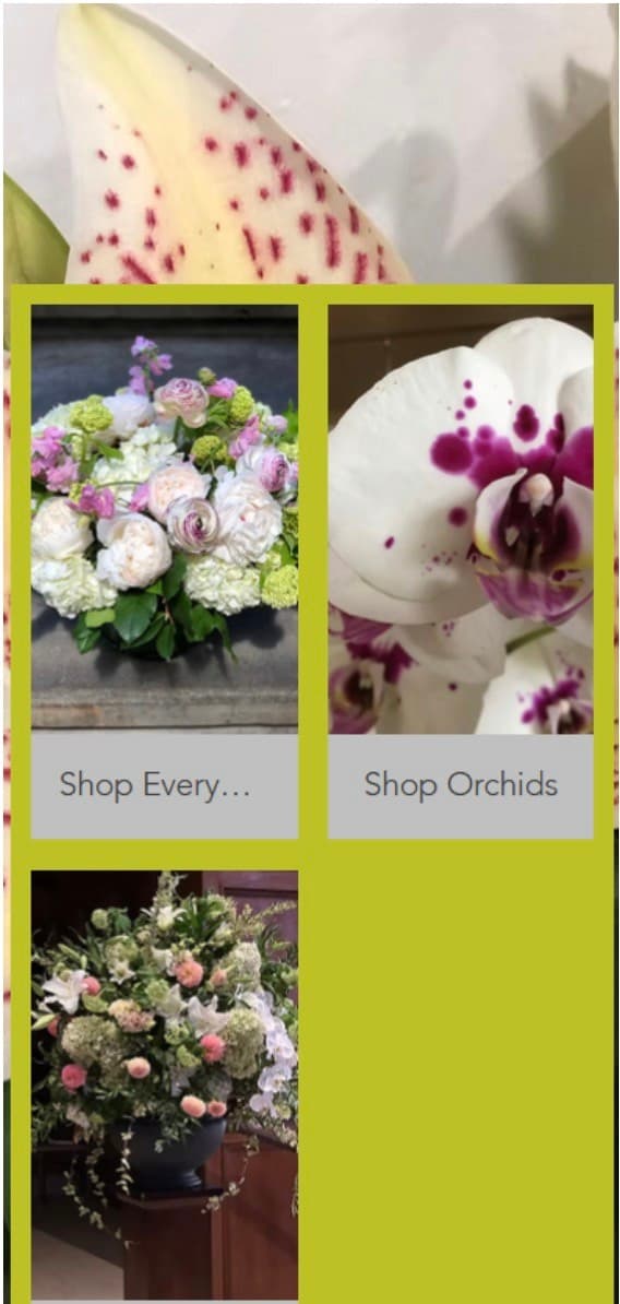
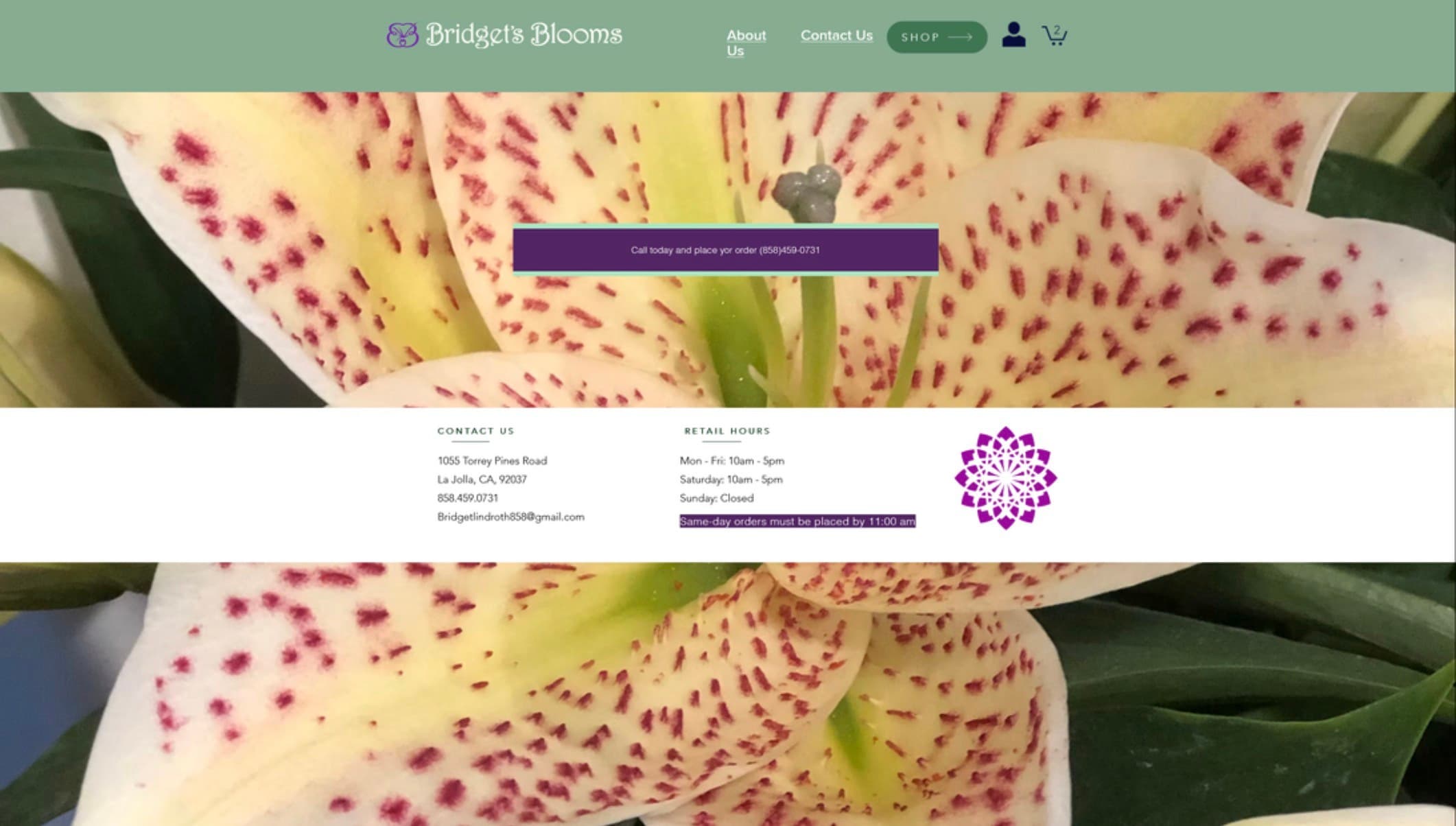
Lack of professional photos
The original site used unprofessional flower photos as page backgrounds. They hurt the brand: the friendly, bright character of Bridget’s shop didn’t come through.
03 / user research
Understanding the problem space
I interviewed 16 people over one week, in the store and on campus, then mapped 30 use cases to define the MVP.
Customers loved the shop in person. The website had to feel just as warm.
16
participants interviewed over one week
2
distinct research sites: in-store + on-campus
30
use cases mapped to define MVP feature set
6
scenarios stress-tested against real customer behavior
Quotes from participants
“Never opened her website, I just come in person to look at the actual flowers.”
“Would be willing to go to a smaller shop if the advertising was very strong, it must be super cute.”
“I use a lot of different websites — the easier the purchasing process the better.”
04 / the big ask
How might we…
How might we make the website feel as warm as walking through the door?
05 / the design space
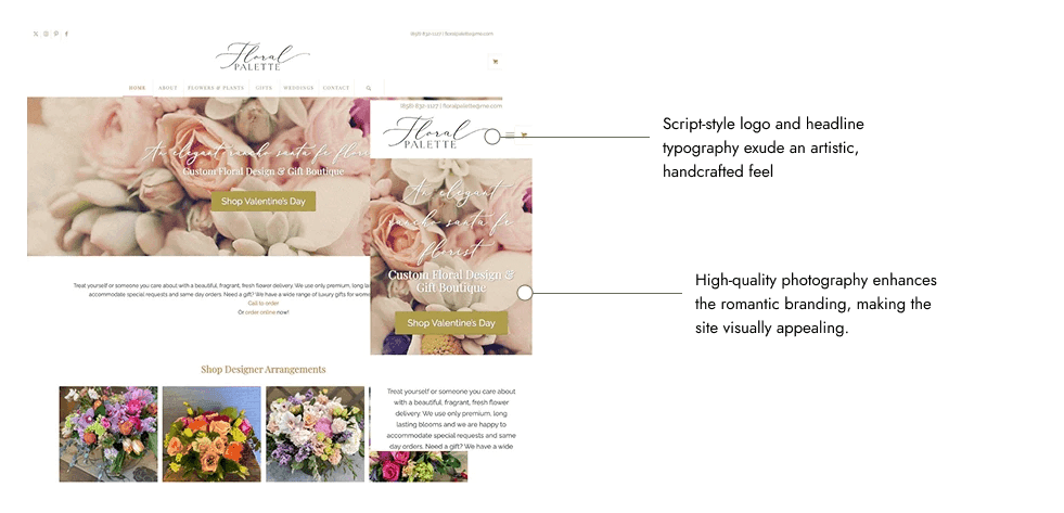
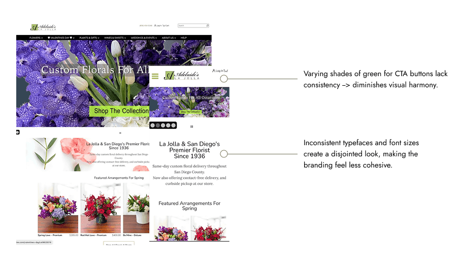
Scoping out the competition
The focus: design sensibility
Her brand rests on her roots as a La Jolla local and a kind, radiant personality that keeps customers coming back. The brief: a more tasteful, refined design that fits her shop and who she is.
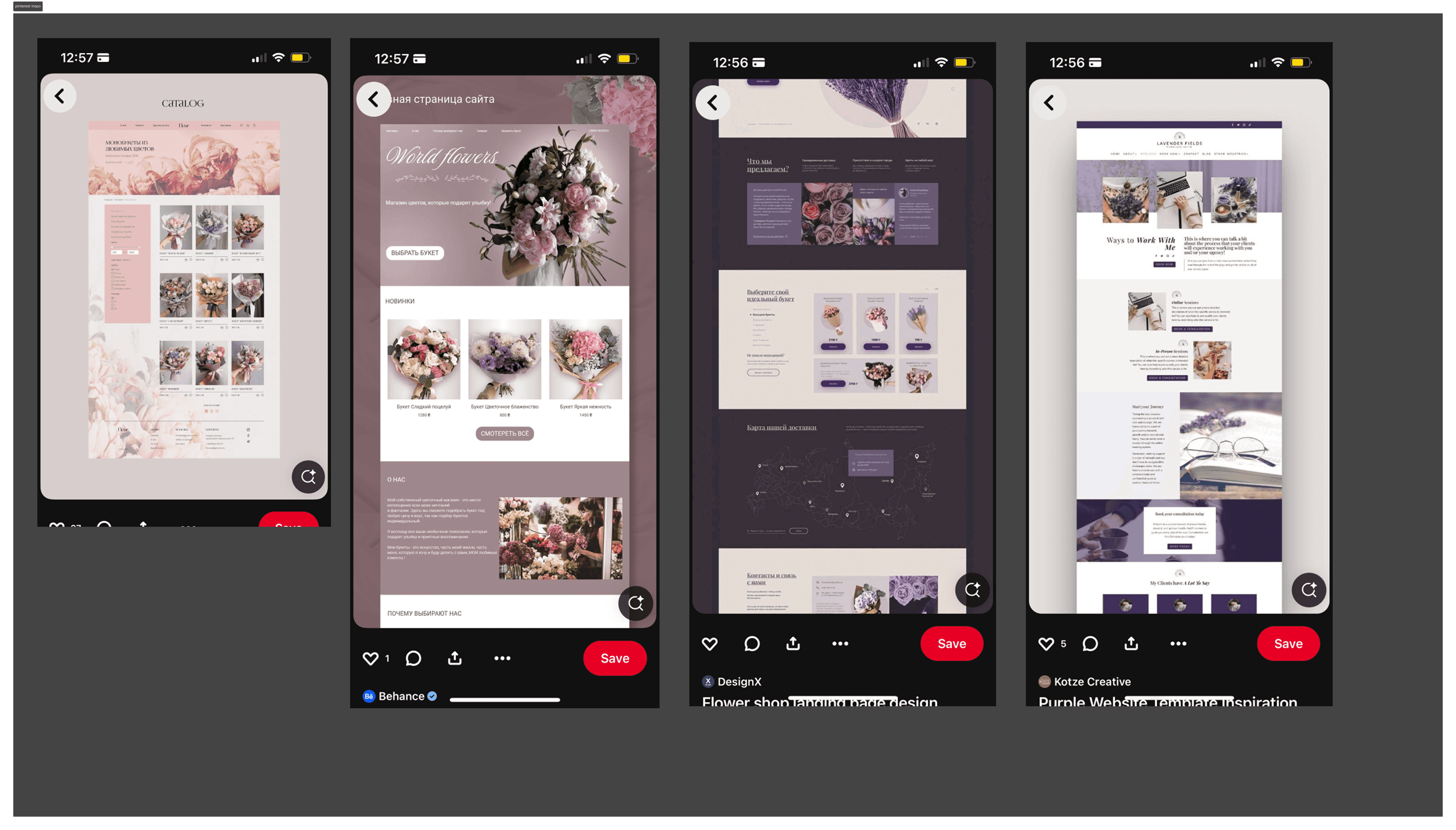
06 / mood boards
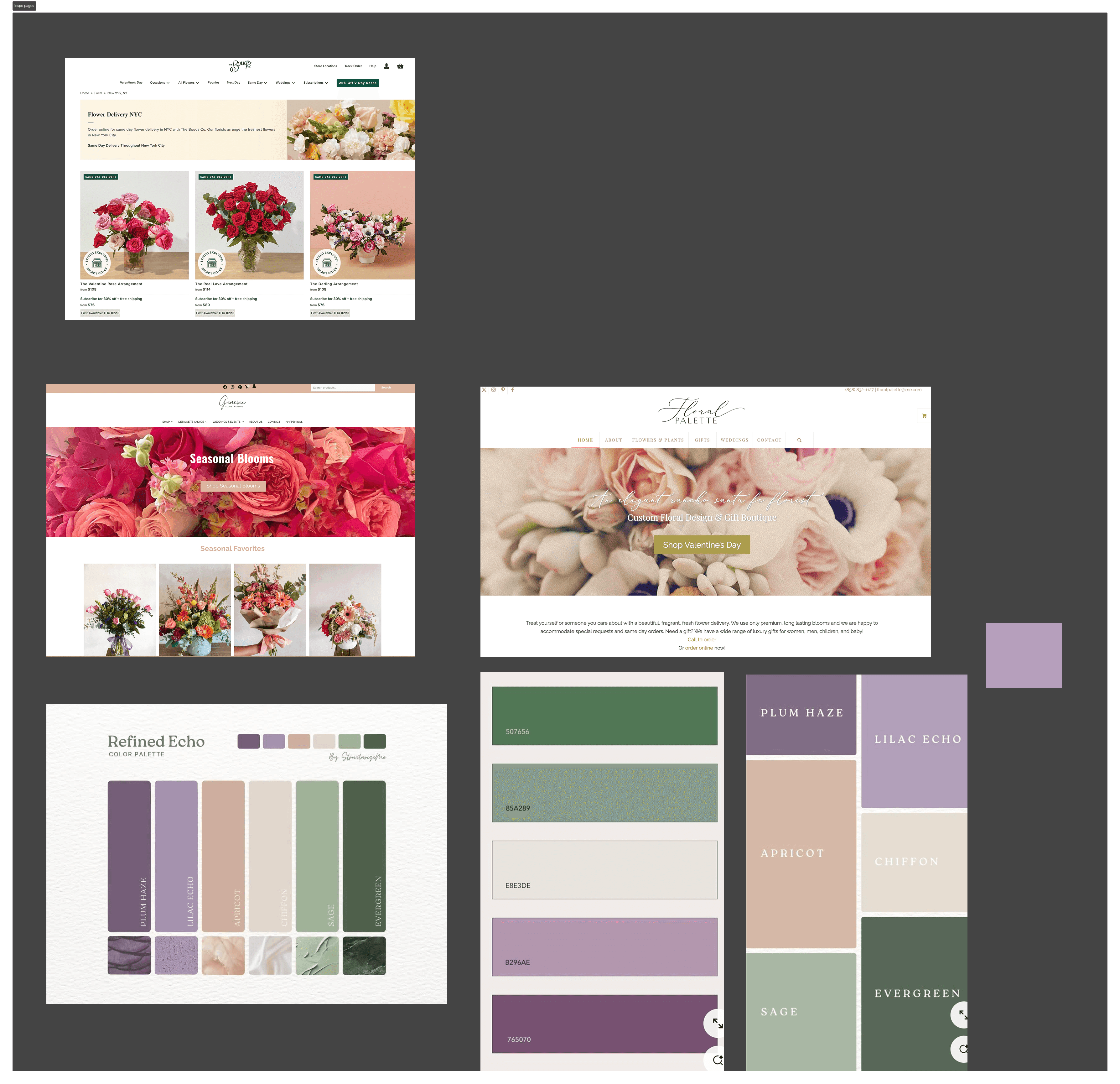
Constructing mood boards
The goal: convey the warmth and elegance customers feel at the boutique.
07 / iteration
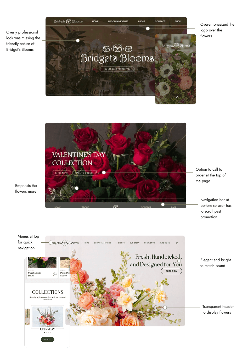
Iteration. Iteration. Iteration.
Three rounds, each surfacing a real tension: polish vs. warmth, information density vs. clarity, promotion vs. navigability.
08 / final screens
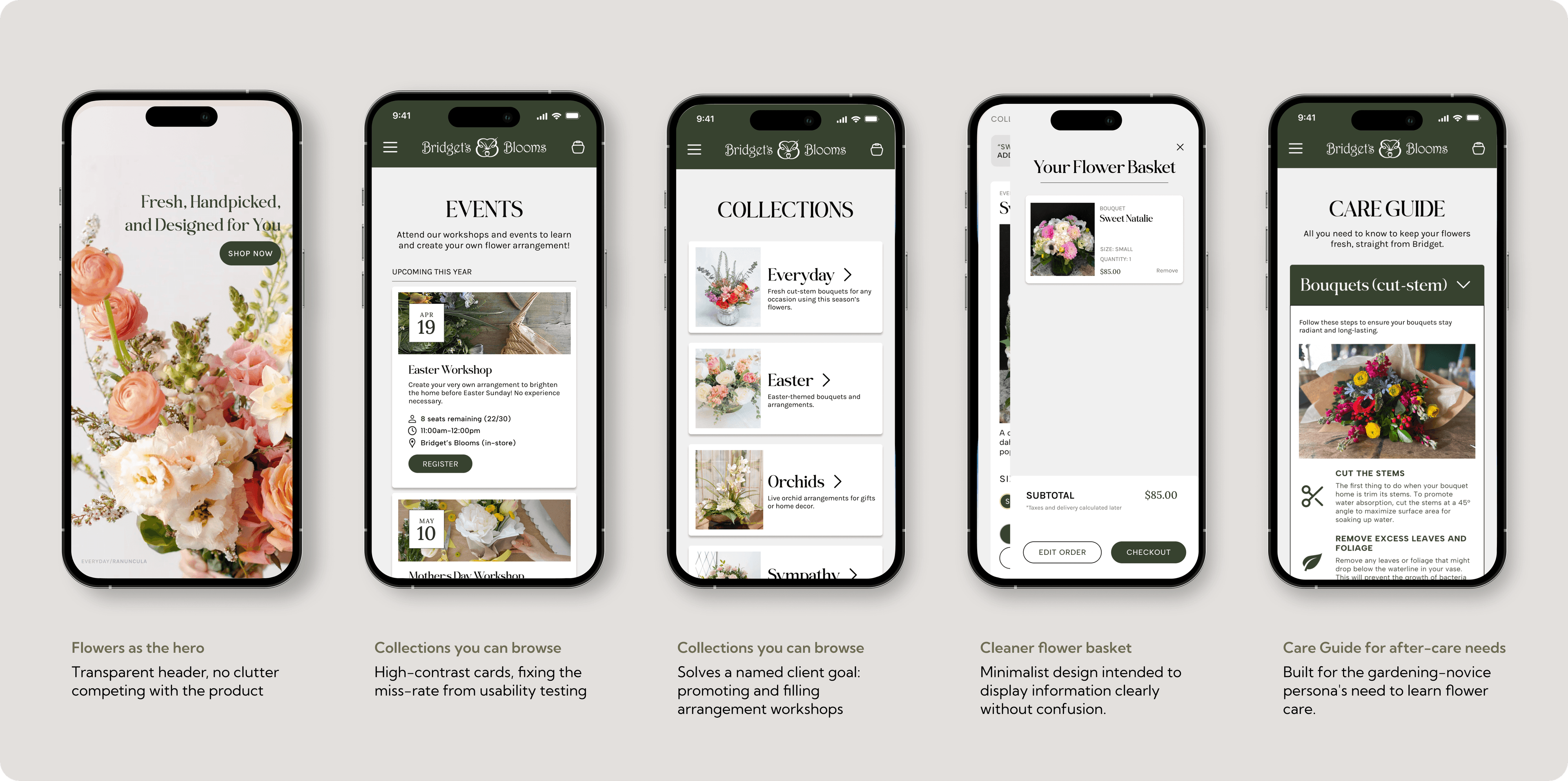
Designed to feel like stopping by in person
Every screen follows one brief: let the flowers do the talking, and get customers where they’re going without friction.
09 / reflection
Managing a real client relationship
The redesign is live at bridgetslajollablooms.com.
“I love the changes you made to my site! Navigation is much easier now.”
She singled out two wins that came straight out of our usability sessions: the new Collections carousel (“shows our orchids beautifully”) and the simplified events flow (“scrolling through events and registering for one is so much easier now”).